


Graphing Absolute-Value Functions: Curvy Lines
Purplemath
Most functions are not straight lines, so you should expect to need to know how to graph the absolute values of quadratics, cubics, and other polynomials, as well as trigonometric functions (eventually). Fortunately, the process for graphing absolute-value functions involving expressions which are curvy lines is exactly the same as for absolute-value functions of nice straight lines.

How do you graph absolute values of curvy lines?
To graph a function that contains the absolute value of a curvy line (such as a cubic polynomial), follow these steps:
- Find the x-intercepts of the curvy line inside the absolute-value bars. These points are where the graph will turn back on itself.
- Fill your T-chart with points. You'll probably quickly figure out which points won't be helpful for graphing (because, say, the y-values are simply too high or low to fit into a reasonably-sized graph).
- Plot your other points from the T-chart.
- Draw your graph, making sure to make curvy bits look appropriately curved; and making sure to make the elbows (that is, the turning points) appropriately sharp.
The simplest non-linear function is a quadratic, which normally graphs as a parabola. If any portion of that parabola goes below the x-axis, then the absolute-value bars will flip that portion up and over the axis.
-
Graph y = | x2 − 3x − 4 |
Inside the absolute-value bars of this function, I've got a quadratic. Without the absolute-value bars, the graph of the quadratic inside the bars is a generic parabola.
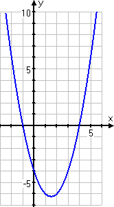
I can confirm (by factoring) that the x-intercepts are at x = −1 and x = 4. I can use a formula to confirm that the vertex is at (1.5, −6.25). The y-intercept is at y = −4.
The "regular" parabola's graph looks like this:
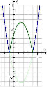
Between the two x-intercepts, the graph goes below the x-axis, which means that the output values from the function (that is, the y-values) are negative. But the quadratic is inside absolute-value bars, and those bars will flip that negative part in the middle, redrawing that portion to be above the x-axis. So I should expect the graph to look like this:
So now I have a good idea of what I should expect my absolute-value graph to be. (I did the above "thinking" on scratch-paper; it will not be part of my hand-in answer. But doing this pre-check is very helpful, by reinforcing what I've previously learned.)
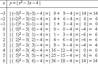
Here's my T-chart:
I've got two consecutive x-values (being x = 1 and x = 2) with the same y-value. This doesn't mean that there's a horizontal line between the points (1, 6) and (2,−6); instead, it means that the parabola's vertex is halfway between these two x-values, and a little bit above the y-values. I'll want to be careful to draw a nice arc between these two points.
After carefully plotting my points and making sure that elbows and curves look like elbows and curves, my graph looks like this:
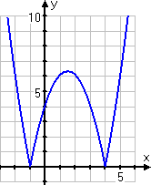
And this is the graph that I'd expected, based on my pre-check.

-
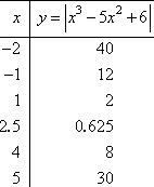
Graph y = | x3 − 5x2 + 6x |
They've given me the absolute value of a cubic. From what I know about the behavior of polynomials, I know that the cubic inside the absolute-value bars comes up from the bottom, maybe flexes a bit in the middle, and then heads upward forever. Since I'll be using the absolute values, I know that the left-hand segment of the graph (and maybe some portion in the middle) will be flipped up and over the x-axis.
I can find the x-intercepts by factoring.
x3 − 5x2 + 6x = 0
x (x2 − 5x + 6) = 0
x (x − 3) (x − 2) = 0
x = 0, 2, 3
Before I go any further, I plot these three intercepts as dots on the x-axis.
I'll need some additional plot points, to be certain of where the graph is going. And, because 2 and 3 are one unit apart, I'll make sure to check x = 2.5, which is midway between these two x-intercepts, so that my arc between these intercepts is at least close to being at the right height. So my T-chart, without the computations, is:
Together with the intercepts that I found, my graph ends up looking like this:
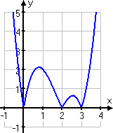
If there had been no absolute-value bars on the function above, then the first and third segments of the line in my graph would have been below the x-axis. The absolute-value bars forced those two segments above the axis.
If you're ever at all in doubt of where the graph should be going, take the time to plot some more points (such as the (2.5, 0.625) point I found above) so you can be certain of your answer before you hand it in.
© 2024 Purplemath, Inc. All right reserved. Web Design by ![]()